
New EHF corporate identity launches
 New EHF corporate identity launches
The European Handball Federation entered a new era from 1 July 2012 with the launch of the federation’s new corporate identity.
Regular visitors to the eurohandball.com will have noticed the change immediately on Monday morning with the implementation of the new logo and secondary elements giving the site a completely new look and feel.
Signs have also been changed in the EHF Office in Vienna and the first youth events of the summer are being played under a new EHF flag.
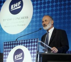
The new logo and branding were also used at the EHF Congress on 22/23 June 2012 in Monaco (pictured right: EHF President, Jean Brihault, addressing Congress).
First revealed at the 10th Conference of Presidents at the federation’s 20 year celebrations in November 2011, the new logo forms part of a project to rejuvenate the EHF’s corporate identity and a move to create a more contemporary look.
The original yellow and blue logo, designed by EHF Executive member, Jozef Ambrus, back in 1991 when the EHF was first formed, and updated in 1997, has made way for a new EHF logo and a complete corporate identity system, providing a toolbox through which the EHF can better communicate its brand.
The new EHF identity has been developed in cooperation with Danish creative agency, e-Types, and represents a simple, functional and modern take on the well-known EHF identities used over the last 20 years. In keeping with the roots and purpose of the organisation, the new identity is fixed around the circular shape of the handball with the EHF logo placed centrally in the middle.
EHF logo video
@@video=ehflogo.flv
Premium and professional
The redesigned logo as well as the custom made European Handball Federation logo type, combine design cues of tradition and elegance with the clean, cool and sporty.
The dark blue EHF colour is what ties all elements together to communicate the neutral yet premium and professional image that EHF aspires to as an international governing body of handball.
A new EHF typography has also be developed, which will be the official typography of the federation and its daughter company, EHF Marketing GmbH.
It is a custom made type set designed by combining antigua and grotesque type styles. The design is meant to evoke a feeling that is as traditional and elegant as it is sporty and modern.

The new EHF logo will become a central point or anchor for all of the federation’s competition and event logos in the future.
The first competitions to undergo this redesign are the EHF’s flagship club events, the VELUX EHF Champions League and WOMEN’S EHF Champions League, which both have new logos, with the new distinctive EHF logo at their core.
A key feature of the new corporate identity is an online Design Guide, where key partners including member federations and the media can download various versions of the logo and also the guidelines for its use.
For access to the Online Design Guide, contact the EHF Media and Communications Department – media@eurohandball.com


